In this tutorial, we’ll walk through the design and implementation of a small but powerful R script that analyzes web server access logs — for instance, NGINX or Apache logs — and produces clean, insightful PDF plots of your website’s traffic patterns.
This project demonstrates how to combine dplyr, lubridate, ggplot2, readr, and optparse to build a command-line data analysis tool in R.
🧰 Overview
The script accepts an access log file, parses and filters it according to date range, regex patterns, and time interval, and then generates a PDF plot summarizing the number of requests per page over time.
Example usage:
Rscript convert.R \
  -l 60 \
  -p '^/$--^/all_posts/.*$--^/post_search/0$' \
  -i h \
  -f access.log
This example analyzes the last 60 hours of requests for three URL patterns (home page, all posts pages, and a search endpoint).
⚙️ Command-Line Options
We use the optparse library to handle command-line arguments:
option_list <- list(
  make_option(c("-f", "--file"), type="character", default="access.log"),
  make_option(c("-s", "--start"), type="character", default="01/Sep/1970:00"),
  make_option(c("-e", "--ending"), type="character", default="01/Sep/2970:00"),
  make_option(c("-l", "--last"), type="numeric", default=0),
  make_option(c("-p", "--pages"), type="character", default="."),
  make_option(c("-o", "--outfile"), type="character", default="out.pdf"),
  make_option(c("-i", "--interval"), type="character", default="h")
)
opt <- parse_args(OptionParser(option_list=option_list))
This provides a flexible CLI for selecting:
- Log file (
-f) - Date range or last N time units (
-s,-e,-l) - Page filters using regular expressions (
-p) - Output file name (
-o) - Aggregation interval (
-i) — by hour, day, week, month, or year
🧩 Reading and Parsing the Logs
The log file is read using readr::read_delim():
df <- read_delim(
  opt$file,
  delim = " ",
  quote = '"',
  col_names = FALSE,
  trim_ws = TRUE,
  col_types = cols(
    .default = col_character(),
    X7 = col_double(),
    X8 = col_double()
  )
)
We explicitly use readr rather than base R I/O for better performance and type safety.
- The
quote = '"'argument ensures that string columns (like URLs) enclosed in quotes are properly parsed. - We explicitly specify column types, so
readrdoesn’t have to guess — everything defaults to string (col_character()), except columns 7 and 8, which are numeric (col_double()).
After loading, we only keep the useful columns:
df <- df[, c(1, 4, 6)]
names(df) <- c("ip", "date", "target")
🧼 Filtering Out Unwanted Traffic
In my case, I wanted to exclude my own IP from the analysis — since my repeated testing requests would artificially inflate the traffic.
excluded_ips = c("86.242.190.96")
df <- df[!df$ip %in% excluded_ips, ]
🕒 Date Formatting with Locale Fix
Before parsing the dates, we set the locale for time to "C":
Sys.setlocale("LC_TIME", "C")
This ensures that month abbreviations like %b (e.g., "Sep") in NGINX logs are correctly recognized. Without it, R might fail to parse dates depending on your system’s locale.
Then, we convert the log timestamp into R’s POSIXct format, which supports vectorized operations:
df$date <- as.POSIXct(substring(df$date, 2), format="%d/%b/%Y:%H:%M:%S")
The great thing about as.POSIXct is that it can convert entire columns at once — no need for loops.
⏱️ Time Interval Logic
To support the --last and --interval options, we define a small dictionary (mult_map) that maps interval letters to seconds:
mult_map <- c(h = 3600, d = 24*3600, w = 7*24*3600, m = 30*24*3600, y = 365*24*3600)
last <- opt$last * mult_map[[opt$interval]]
This lets us easily compute “last 60 hours” or “last 7 days” in seconds. We then filter the dataset accordingly:
if (opt$last == 0) {
  df <- df[df$date >= start & df$date <= end, ]
} else {
  df <- df[df$date >= (max(df$date) - last), ]
}
🔍 Regex-Based URL Filtering
One of the most powerful parts of this script is that it allows regex filtering for target URLs.
First, we clean up the target column to remove the HTTP method and protocol version:
df$target <- mapply(function(x) {
  posvec <- gregexpr(" ", x)[[1]][1:2]
  substring(x, posvec[1] + 1, posvec[2] - 1)
}, df$target)
Then, we parse the user-specified patterns from the --pages option, which are separated by --:
patterns <- strsplit(opt$pages, "--")[[1]]
Each element in this vector is a valid regular expression, for example:
'^/$--^/all_posts/.*$--^/post_search/0$'
We filter the dataset by applying all regex patterns using Reduce():
df <- df[Reduce(`|`, lapply(patterns, function(p) grepl(p, df$target))), ]
Here’s what happens step by step:
lapply(patterns, function(p) grepl(p, df$target))runs each regex pattern against thetargetcolumn and returns a list of logical vectors (TRUE/FALSE for each row).Reduce(`|`, ...)combines all these logical vectors using the OR operator (|), meaning a row is kept if it matches any of the given regex patterns.- This approach allows multiple flexible regex filters in a single command-line argument.
📅 Aggregating by Time Interval
We create another small dictionary to translate shorthand interval options into human-readable units for lubridate::floor_date():
interval_map <- c(h = "hour", d = "day", w = "week", m = "month", y = "year")
df$date <- floor_date(df$date, unit = interval_map[[opt$interval]])
🧩 Grouping URLs by Regex Pattern
Because multiple URLs can match a single regex pattern, we regroup them accordingly:
df$target_group <- df$target
for (ptrn in patterns) {
  df$target_group <- ifelse(grepl(ptrn, df$target_group), ptrn, df$target_group)
}
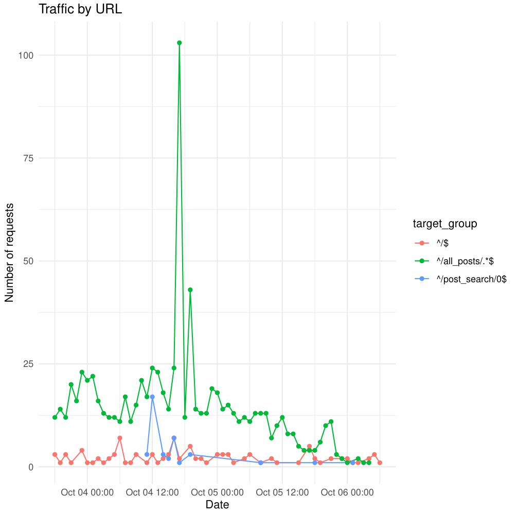
📊 Aggregating and Plotting
We use dplyr to aggregate the number of hits per page group and time unit:
agg <- df %>%
  group_by(target_group, date) %>%
  summarise(hits = n(), .groups = "drop")
Then we create a clean, readable line plot using ggplot2:
ggplot(agg, aes(x = date, y = hits, color = target_group)) +
  geom_line() +
  geom_point() +
  labs(
    x = "Date",
    y = "Number of requests",
    title = "Traffic by URL"
  ) +
  theme_minimal()
Finally, we output the plot to a PDF file (default out.pdf):
pdf(opt$outfile)
# (ggplot code here)
In this section, we group the data temporarily in order to compute a new column called hits, which represents the number of requests per target page and time interval.
The line group_by(target_group, date) creates groups based on each unique combination of page (or regex-matched pattern) and date. This grouping allows summarise() to apply the counting operation n() within each group independently.
After the aggregation, the argument .groups = "drop" tells dplyr to remove the grouping structure from the resulting data frame. This means the output agg becomes a clean, flat table where each row corresponds to one (page, date) pair, without any lingering group metadata.
This is useful because ggplot2 doesn’t need the data to remain grouped — it will automatically distinguish the groups using the color = target_group aesthetic in the plotting function. Each color represents one web page (or pattern), and each point corresponds to a given time unit in which hits were counted.
In short, we group the data only to compute the hits column, then drop the grouping to simplify plotting. The structure of the dataset remains tidy, with one observation per time point and page group.
🤖 Filtering Out Bots
After removing unwanted IP addresses, we can also exclude automated traffic such as bots, crawlers, and scrapers. These tend to generate noise in the analysis by sending large volumes of requests that don’t represent real user visits.
We define a list of common bot keywords that often appear in the User-Agent string of HTTP requests, such as bot, spider, crawler, or curl. We then combine them into a single regular expression pattern using paste(..., collapse = "|"), which creates an OR pattern matching any of these words.
# We filter bots here

bot_keywords <- c(
  "bot","spider","crawler","curl","wget","python","scrapy",
  "ahrefs","ahrefsbot","semrush","mj12","dotbot",
  "googlebot","bingbot","yandex","uptime","pingdom","monitor",
  "facebookexternalhit","slurp","baiduspider"
)

bot_pat <- paste(bot_keywords, collapse = "|")

df <- df %>%
  filter(!grepl(bot_pat, .[[10]]))
Here, the dot (.) refers to the current data frame being processed inside the dplyr pipeline — in this case, df. Using .[[10]] accesses the tenth column of the data frame, which corresponds to the User-Agent field in standard access logs.
The grepl(bot_pat, .[[10]]) expression checks whether any of the defined bot keywords appear in the user agent string. The ! in front negates the condition, meaning we only keep rows where no bot pattern is found. In other words, all detected bot requests are filtered out.
This ensures that the final analysis focuses exclusively on genuine human traffic, producing cleaner and more meaningful results.
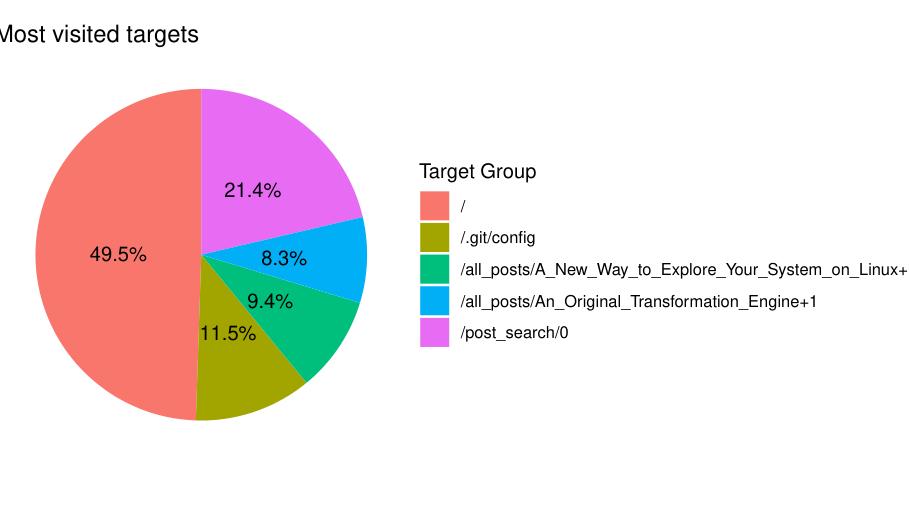
🏆 Displaying the Top 5 Most Visited Pages
To complement the time-based traffic visualization, the script now includes an optional feature that displays the five most visited pages on the website. This feature can be enabled with the -m or --most flag.
The new option is defined in the command-line argument list as follows:
make_option(c("-m", "--most"), type="logical", default=FALSE,
              help="most visited webpages", metavar="MOST"),
When this flag is set, the script will calculate the total number of hits for each target (individual page or URL) and visualize the top five as a pie chart.
if (opt$most) {

  agg <- df %>%
    group_by(target) %>%
    summarise(hits = n(), .groups = "drop") %>%
    arrange(desc(hits)) %>%
    head(5)

  ggplot(agg, aes(x = "", y = hits, fill = target)) +
    geom_bar(stat = "identity", width = 1) +
    coord_polar(theta = "y") +
    theme_void() +
    labs(
      title = "Most visited targets",
      fill = "Target Group"
    ) +
    geom_text(
      aes(label = paste0(round(100 * hits / sum(hits), 1), "%")),
      position = position_stack(vjust = 0.5)
    )
}
The logic is straightforward:
- We first group the data by
target— each unique page or endpoint. - Then, we count how many times each page was requested using
summarise(hits = n()). - We sort the result in descending order with
arrange(desc(hits))and keep only the first five entries usinghead(5).
This aggregated data is then plotted using ggplot2 as a pie chart. We start by drawing a bar chart with geom_bar(stat = "identity"), and then convert it into a circular layout using coord_polar(theta = "y").
Each slice represents one of the five most visited targets, and the geom_text() layer adds percentage labels directly on the pie chart, showing each page’s share of total visits.
The resulting chart provides a quick and visually clear summary of your most popular content — useful for understanding which pages attract the most user attention over time.
✅ Result
The result is a color-coded time series chart showing how request volume evolves over time for each URL group — powerful for spotting traffic trends, identifying popular endpoints, or debugging spikes.
✨ Key Takeaways
Sys.setlocale("LC_TIME", "C")is essential for parsing English month abbreviations from NGINX logs.readr::read_delim()provides high-speed, type-safe parsing with explicit column control.- Regex-based filtering with the
--pagesoption allows flexible URL grouping, separated by--. Reduce(`|`, ...)combines multiple regex matches efficiently with an OR operation.lubridate::floor_date()simplifies time-based aggregation.- The script is modular and easily extended — for instance, adding status code or IP-based summaries.
Author: Julien Larget-Piet
Project: Access Log Analyzer in R
License: Open for educational use
Comment